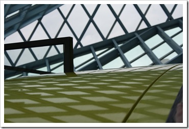
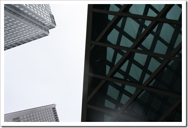
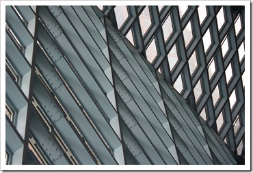
Last weekend I had the opportunity to visit The Seattle Public Library for the first time. I was mesmerized by its supreme architecture and clever design. The simplicity of the materials, but the complexity of its construction has made of this building an architectural icon in the United States. I was also lucky enough to have this building as my hotel view during my stay in Seattle.
The Central Building for the Seattle Public Library was designed by Rem Koolhaas and Joshua Prince-Ramus of OMA/REX. I found the space really inspiring, so much that I would like to share some of my favourite shots.
Next time you are in Seattle, this is a must see building.


Thanks to the magic of Wikipedia here are the facts
- The Seattle Central Library is the flagship library of the Seattle Public Library system. The 11-story (185 feet or 56 meters high) glass and steel building in downtown Seattle, Washington was opened to the public on Sunday, May 23, 2004. Rem Koolhaas and Joshua Prince-Ramus of OMA/REX were the principal architects and Hoffman Construction Company of Portland, Oregon, was the general contractor. The 362,987 square foot (34,000 m²) public library can hold about 1.45 million books and other materials, features underground public parking for 143 vehicles, and includes over 400 computers open to the public. Over 2 million individuals visited the new library in its first year. It is the third Seattle Central Library building to be located on the same site at 1000 Fourth Avenue, the block bounded by Fourth and Fifth Avenues and Madison and Spring Streets. The library has a unique, striking appearance, consisting of several discrete "floating platforms" seemingly wrapped in a large steel net around glass skin. Architectural tours of the building began on June 5, 2006.
Seattle Public Library by Iván Meade
Iván Meade is a local designer and principal of Meade Design Group, a multidisciplinary interior design and graphic design studio in the heart of downtown Victoria B.C. Canada – www.themeadegroup.com
MEADE DESIGN GROUP - THE BLOG. Copyright 2007-2011


16 comments:
I toured the Seattle Public Library on the recommendation of a friend when I was visiting there a couple of years ago.
She prefaced her recommendation by saying it's not your usual tourist recommendation, but stressed that I would really enjoy it if I went.
And I did. The inner walkway was very cool, as was the electronic display showing the search terms people at the the 100 workstations on the main floor were using, and the listing of books being checked out.
So impressed.
gorgeous architecture! my creative wheels are spinning!!
As much as I love books and libraries I have not seen Seattle's Library yet. Your photography is stunning, so graphic and clean.
I remember once you posting pictures of your photos of the sea and waves and I was in instant love with them. Now I am inlove again with these photos. You should one day have a show for your photography.
PS cant find that older post of the waves on the blog.
Hi Ivan
Seattle - I am so jealous as it is one of my favorite cities to visit. I went to see the Seattle Library just after it opened, and I fell in love with it. It really makes the experience of being in a library exciting. As you walk up the ramps of books you have an experience with the books and you just want to reach out and take one off the shelves.
This Library was just voted one of the most important buildings constructed since 1980 in a recent article in Vanity Fair. It was quite an engineering feat to build and is one of the most beautiful and significant pieces of Architecture I have seen!!!
Here is the link to the Vanity Fair article.
http://www.vanityfair.com/culture/features/2010/08/architecture-survey-slideshow-201008?currentPage=all
Impressive to say the least. One wouldnt normally think of a library as being an architectural gem... however obviously this is not the case here. This is amazing.
Your photographs are fantastic. Nice work!
Thank you so much for your comments - I was very inspired by the Architecture of this place and I am so glad the pictures are being so well received.
Happy Sunday!
Your photographs are just stunning Ivan! And...I love the ducks!! A touch of whimsey is cool.
I also suggest taking a trip to Tacoma to the Museum of Glass by Arthur Erickson...just so great! Actually, Tacoma is becoming the cool sister to Seattle, as the waterfront is being developed with a historical nod.
Thanks for the virtual trip...hope you had lots of fun in Seattle:)
Best,
Michelle
Very nice, I will have to make it out to see it sometime soon - Seattle is a great place to visit!
I love the floor, I think that's such a creative and beautiful solution for a library - cool shots!
Great find! Had no idea that the Seattle public library was designed so well. Really liked the flooring, with the engraved letters, and the "bookworms". When I get a chance to visit Seattle, will definitely visit this place. Thanks for sharing!
Too bad, I was just in Seattle! I will definitely save a day for our next trip to see the Library :)
www.hangingonthewall.ca
Clearly, you have not looked at the building from the point of view of a user or as a librarian.
I am a librarian, and got lost in the building on the "red" floor which was very disturbing.
The staff has had to make up paper signs to post around the building to guide the public to places like the rest room.
It is an incredible architectural statement, but is unusable for the purpose that it was designed.
Hi! Michael,
Thank you very much for your insight.
I didn't have time to appreciate the function of the building, and I was really impressed with the beauty of the building. I have to say that It was great to see the library being use by lots of people in every section.
I do remember the red floor - Actually none of my photos there worked out and it really surprised me to see so much red when this colour is associated with anger. I'm with you with the fact that a building needs to be functional and beautiful. I hope they correct these issues soon.
I'd have to agree about the red floor--I went to a conference there and it was very unsettling. A neon lime green elevator opens onto this deep red floor with curving walls and a sense that you're inside of an alien spaceship. I also heard that the barf-green colors in the bathrooms were designed to discourage homeless people from hanging out in there and taking a sponge bath in the sink.
That said, you certainly captured the most beautiful shots of its architecture, though. One of my favorite parts of the library is the high lookout space on the very top floor that lets you see alllll the way to the bottom.
Yeah, not very functional or comfortable as a good reading space, though.
I don't know, to me it looks amazing. Simply beautiful!
Post a Comment