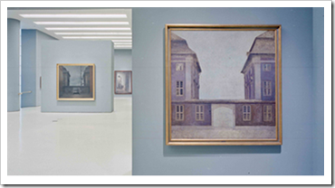
Gallery Colours & Classic Colours
Installation view from Villhem Hammershøi, Solomon R. Guggenheim Museum, New York,
Installation view from The Aztec Empire, Solomon R. Guggenheim Museum,
New York
Paul Gauguin, In the Vanilla Grove, Man and Horse (Dans la vanillère, homme et cheval), 1891. Oil on burlap, 28 ¾ x 36 ¼ inches (73 x 92 cm). Solomon R. Guggenheim Museum, New York,
Amedeo Modigliani, Nude (Nu), 1917. Oil on canvas
PRODUCT
MANUFACTURER
Fine Paints of Europe
COLLECTION
DESCRIPTION
As a designer, I like the art pieces in my interior design projects to stand out and be the protagonists of the room. Sometimes I play with theatricality, other times I want the piece to blend in and become part of the space, but in the end I want these pieces to have the best background possible.
I usually select my colour palettes to complement the art pieces, but to let the background maintain a dialogue with the materials, fabrics and furnishings used in the space. When I found out that “The Guggenheim” had launched a new paint collection my initial thought was ‘another one!?’, but when I reviewed the colours and learned that the colours have been inspired by their art collection, my initial thought went away.
“This colour collection reflects the Guggenheim’s celebrated collection of modern masterpieces, and recreates the color palette of artists such as Paul Cézanne, Vincent van Gogh, Robert Delaunay, Giorgio de Chirico, and Vasily Kandinsky. Each color was carefully chosen from paintings in the Guggenheim galleries. The selection was then refined in consultation with exhibition designers to ensure the colors are appropriate for a variety of architectural settings. Fine Paints of Europe precisely matched each color and created the final formulations.”
- Guggenheim Colour
Unfortunately, this collection is only available as an international order and according to the reviews, this environmentally friendly paint is on the pricey side. My thoughts on this: if you can’t purchase a Master at least you can have a master’s palette in your home, and if you happen to have a master in your home - like a Picasso or a Miro - why not complement the painting with a wall paint of equal quality? In the end, the claim to fame for this collection is the hue and the value of their colour selections, the quality of the paint and the fact that for more than 50 years the background colours at the Guggenheim museum have been extremely well received. For me, one of the things I have always admired in art is the use of colour and I personally think that this collection is onto something big.
YUMMY FACTOR
Sweet!!!
MEADE DESIGN GROUP - THE BLOG. Copyright 2007-2011


2 comments:
That's exciting design news - looks like a lovely palette!
Very exciting!
Post a Comment