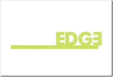
We cannot wait to share our most recent stationery and website package with you – EDGE architecture.
Founder of EDGE architecture Gastón Castaño [maibc] came to Meade Design Group for an identity that would appeal to his design-conscious clientele. His company mantra? "The name edge recognizes the firm’s goal to provide a competitive edge to design practices that want to add value to their project deliverables".
We went for it, with a bold typography style and bleed that is most certainly eye-catching. The stationery was printed in four colours to maximize the punchiness of the edge brand, and even features a die-cut to enhance the unique feature of the offset lettering within the logo.
To learn more about Gastón Castaño and his firm, please check out his website at:
MEADE DESIGN GROUP - THE BLOG. Copyright 2007-2011


5 comments:
Very cool Ivan. I love the design, the EDGE on the edge!
xoxo
Karena
Art by Karena
I hope you will come and enter my Giveaway from the Jose Esteves Collection at Interieurs!
Ivan, This is a great logo. Really eye catching and such a great play with on the edge.
Wendy Wilson
Unique Interiors.
Such a great project. And the photos don't really do the printed goods justice - they are stunning in person. The foiling gives a debossed effect that brings the print job to the next level.
so hot.
Ja, this is a great logo. Really pops.
Post a Comment